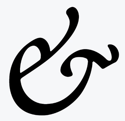
The ampersand (&) is an often over-used abbreviation for the word “and.” It seems like I’ve seen it used incorrectly a lot recently — maybe it gets more use because with all the texting, people tend to abbreviate everything.
From what I think I was taught years ago, its use should be limited…. like when space is very limited, maybe in a table that has a lot of text, or certain company names, such as “Smith & Sons, Inc.,” or when it’s used in a logo or something that artistic considerations dictate its use.
An ampersand should never be used in general writing just to abbreviate the word and.

It’s interesting to note that the shape of the ampersand character varies from font to font. All computers have numerous fonts already installed and you can download hundreds from the Internet. Some of them are very stylish — if you’d like to use an old or unusual style ampersand in your writing (it might make your writing more sophisticated) experiment with setting a regular ampersand in italics. In some fonts (e.g. Garamond) this produces an old-style ampersand. The one I’ve shown at the left is from the Garamond Premier Pro font family.
If you look at it and use your imagination, you see the letters e and t. This is because the ampersand character is a stylized form of the Latin word er, which means and.
Is that cool, or what?
Aren’t you glad you checked this blog today?
— 30 —
